Saturday, July 24, 2021
Covid Update: Perspective
I promised ages ago to look at the impact of Covid (and Covid policies) on total mortality rates. The final scores won't be in for years, but we can look at what we have today:
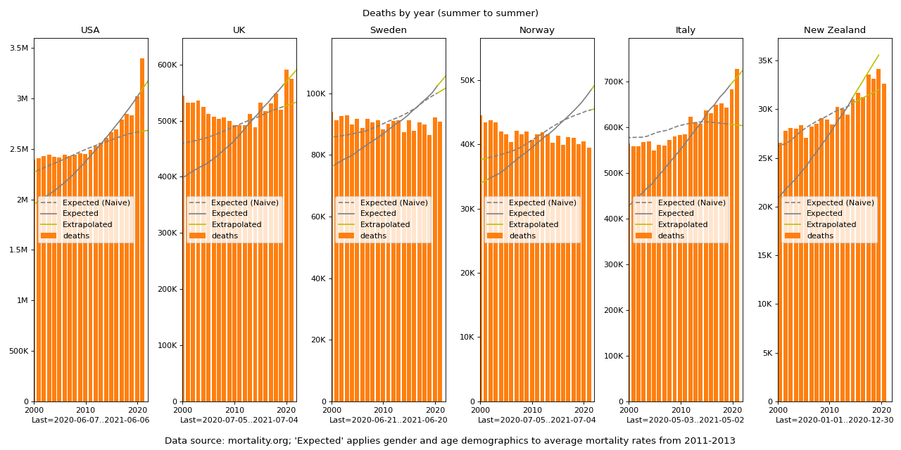
The bars show absolute deaths by year. I'm counting summer to summer rather than by calendar year because otherwise if the flu (or whatever) season comes a little late or early it can wildly favor one year or the other, whereas summers tend to be fairly boring and stable.
The dashed line is the trend line you would expect deaths to follow if they were just a fixed percentage of the population as a whole--not taking into account demographic shifts over time.
The solid line accounts for age and gender demographics--quite a bit different! Specifically, that line is what deaths we would expect if the death rates per gender and age were stable, but with the population demographics changing as they actually are. (Where that data runs out, they are simply linearly projected from the last couple of years.)
Using that, we can adjust for demographics:
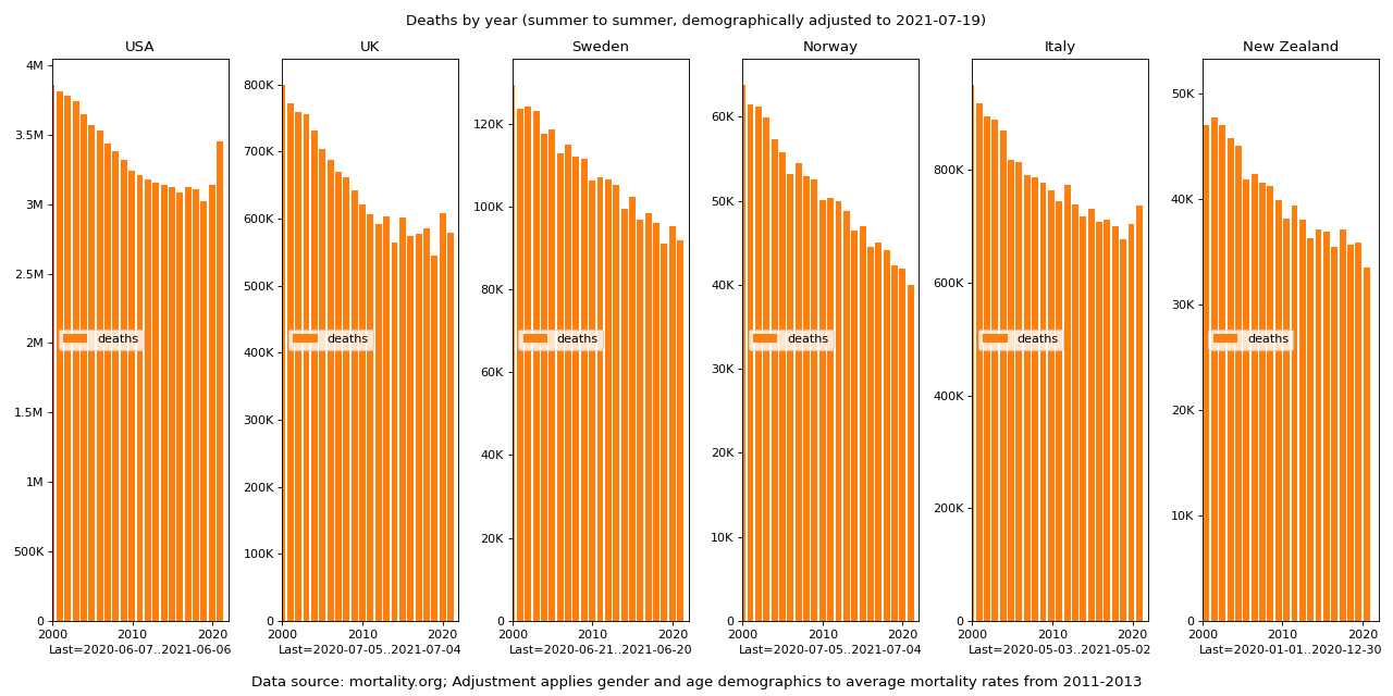
Here, if the mortality rates (per age and gender) were stable, these lines would be flat. That is, this version of the graph shows only the change in mortality rates, not any changes due to demographic shifts. It is analogous to an "inflation adjusted" price chart showing past prices in today's dollars, but showing past deaths in today's equivalent deaths.
From this it's evident that death rates are generally going down everywhere, and you can certainly see the impact of Covid in US, UK, and Italy.
But you can also see that 2019 had an atypically low death rate in those places, which we should account for due to "dry tinder" (most of the people who die in a given year are inherently in their last years of life, and if they are spared by a kind year they're just that much closer to their inevitable end the next year).
So here is the same chart with a three year moving window:
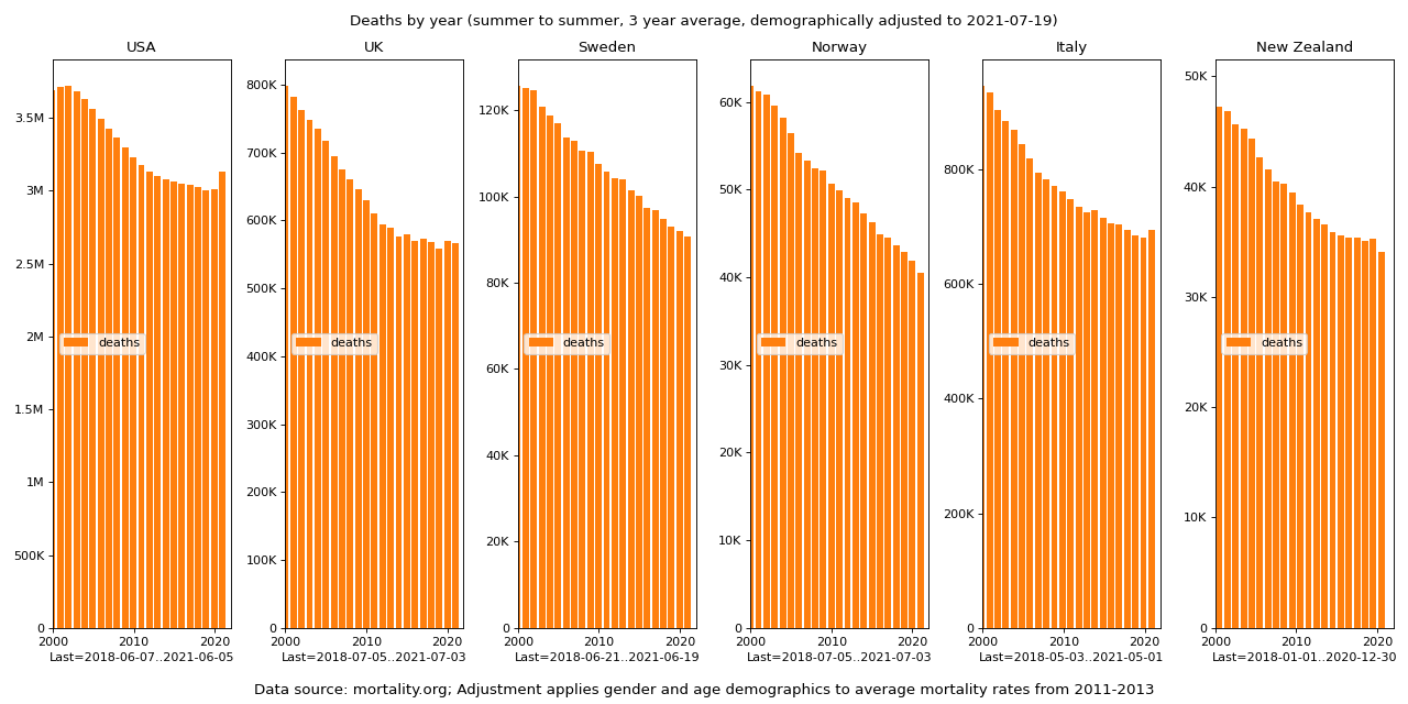
Note that this will understate the impact of Covid by about a third, but only that because two of the three years being averaged by the last year are Covid years. Also, since all years are similarly smoothed, the relative variance is still fully represented.
From there it appears the US has done the worst, with Italy second, and surprisingly the UK doesn't look too bad relative to it's recent but pre-Covid trend. New Zealand and Norway have visible drops--it will be interesting to see that play out in the next couple of years.
Norway looks better than Sweden (though no more so than it did back in 2006), but on its own you'd be hard pressed to see any impact from Covid on Sweden at all. Certainly, contrary to what people keep telling me, Sweden is not an obvious failure or catastrophe.
Looking at the US as worst case, deaths (3 year window--i.e., accounting for the very low 2019; and again, adjusted for demographics) are about back to 2011 levels, and nowhere near where they were back in 2002.
Going back to the non-smoothed version, so we can align exact values, here is how many of those deaths have been attributed to Covid:
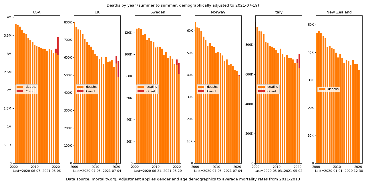
It's anybody's guess how many of those people died of Covid vs. with or near it.
Here is that same graph (unadjusted) in the context of the total population -- these are all the people under lock-down:
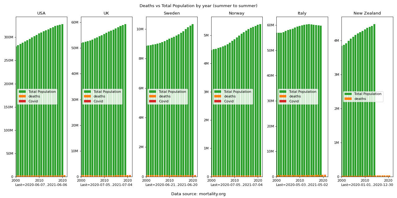
If you look carefully, you can see the Covid deaths wherever they didn't round down to less than a pixel.
Now, on the one hand we could look at this and say it was all a big nothing burger--I don't recall mass panic back in 2002 over all the (relatively much more) deaths. But some would say: well this is because we locked down! It would be an entirely different picture if we hadn't! But then of course there's Sweden. We'll just ignore Sweden.
But that begs the question: What if?
People like to compare Covid IFR (infection fatality ratio) to the flu, but I'm more interested in comparing it to the IFR of just being alive:
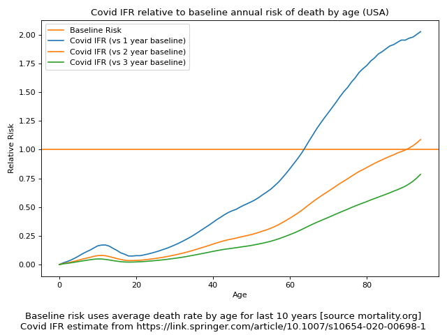
Apparently if I'm under 63, I can catch Covid every year from scratch (i.e. as if my immune system just completely forgot about it) and I'm still more likely to die of something else first. And if I caught Covid every three years for my entire life, I'm still more likely to die of something else first.
This is not after accounting for lockdowns and masks and all that: This is the worst case of unmitigated going out and catching it.
So, if you've been wondering how worried you should be about dying if you catch Covid, the answer if you're under 63 is: Less than you should be worried about dying in the next year just from being alive. And if you're over 63: up to twice as much as you should be worried about dying in the next year just from being alive.
(For those who assume I'm using an optimistic estimation of Covid IFR, I invite you to examine the referred paper, and to note that when applied to the demographics of the various countries it predicts average IFRs higher if anything than any of the usually quoted numbers. It is a pessimistic model if anything!)
Now, to be fair, the goal post has shifted since I first suggested this analysis over a year ago: Now we're concerned about Long Covid, as we reasonably should be. But if we're going to look at subtler side effects than death, we should probably look at the subtler side effects of lockdowns too, so that's a cost-benefit analysis for another day.
And to be clear, I'm certainly not saying you want to go out and get Covid. There's plenty to be concerned about. But hopefully at least this gives you a more concrete sense of the risk of imminent death, which seems to be be high on people's minds.
Furthermore, that IFR (and possibly Long Covid) is most likely significantly reducible with early treatments (vitamin D3 prophylactically; calcifediol, ivermectin, and others accutely), not to mention the vaccines, neither of which the above IFR takes into account, so there's that.