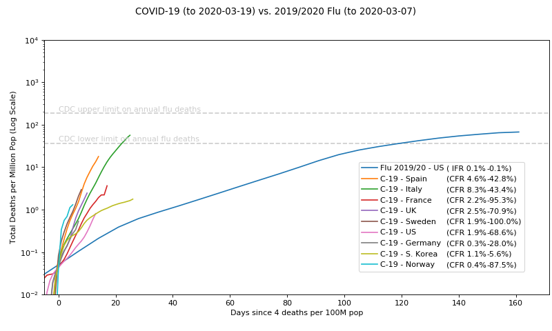
Thursday, March 19, 2020
COVID-19 vs The Flu
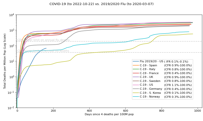
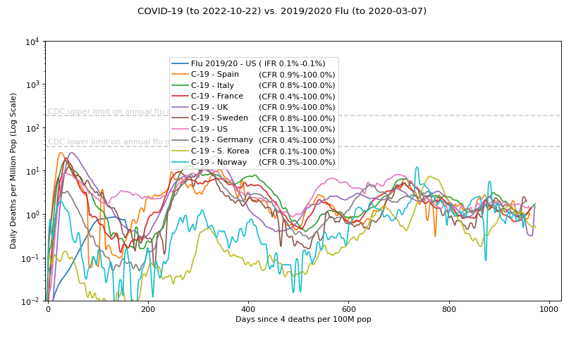
I'm still seeing "just a flu" posts so I thought I'd dig into the data and compare. Here is a chart of this year's (typical) flu season so far (US only) vs. COVID-19 in various countries, normalized by population, and aligned in time based on when they started to take off:
In theory these should update nightly at 10:30pm (Pacific). No promises for how long.
[Update: Shutting this down 2022-10-24]
Here's what it looked like when this post was written...
Some related cursory observations:
Note that if Italy's regluar flu season is anything like the US's, they've already matched flu deaths in a very short time.
Note that all countries are on similar trajectories (pre-intervention), including Germany. Germany's low-end CFR numbers look good just because it's early and the deaths lag. Korea looked good early too. Germany's CFR range will converge as Korea's did with time.
The log scale visually underrates the significance of those slope differences, but they are huge.
Given the similar slopes, Italy is probably representative of what would happen in any of those countries in the absence of interventions. Not pretty!
Oh, and I chose deaths because it's the most reliable stat--not dependent on test coverage of the general population.
This could be misleading for something super prevalent and contagious with very low death rate, except then we would see the curves flatten due to saturation (as we see with the flu curve). That Italy is still going strong above where the flu slope peaked says the fatality rate is (probably much) higher than the flu. (Note this is an independent indicator of fatality rate that doesn't rely on testing.)